How to create Marketing Page with Drag & Drop Template?
Overview
Creating an engaging and effective marketing page can significantly improve your lead generation and conversion rates. With Meritto's Drag & Drop Template, you can easily design a marketing landing page without needing any coding skills. A Landing Page is a standalone web page designed for marketing, where visitors arrive after clicking a link in an email, ad, or similar online source.
This guide will walk you through the step-by-step process of creating a marketing page using the Drag & Drop Builder.
Plan & Permissions
Before you begin, ensure the following:
You have access to the Template Manager in your Meritto account.
A domain has been enabled for landing pages (either existing or newly added).
You have the necessary permissions to create and manage landing pages.
Core Functionalities
- Marketing Page: Only widget supported
- Application Page: Supports both registration form and widget
- No coding required
- Mobile & desktop responsive
- Use HTML, CSS, JS
- Separate pages for mobile and desktop
- Max 5 CSS & 10 JS files
- Image & font folders ≤ 5 MB
- Clean up unnecessary JS/CSS to avoid form issues
- Banner width: 1366px; height auto-adjusts
Step-by-Step Guide to Create a Marketing Page with Drag & Drop Template
Step 1: Enable Landing Page Domain
You can use an existing domain or add a new one to host your marketing page.
Option 1: Use an Existing Domain
College slug is enabled by default (Meritto sub-domain or whitelisted domain).
This domain can also be used for creating landing pages, with the format <domain>/lp/<path>.
Since application pages are LIVE on this same domain,"lp" will be added between the domain and path to distinguish landing pages from application pages.
Option 2: Add a New Whitelisted Domain/Subdomain
College can add additional whitelisted domain/subdomain.
On this domain, only marketing pages can be hosted.
The format of this domain will be: <domain>/<path>.
The process to Enable a New Domain.
Domain Whitelisting Process
Select a domain.
Complete CNAME mapping at the college's end.
Send an email to the Tech team to complete the whitelisting process.
Enabling New Domain

Go to the "Manage Institute" configuration.
Search for the college for which the new domain needs to be added.
Click on the Action button and select the Configuration option.
Scroll Down and go to "Domains for Marketing Landing Pages”.
Add a new domain and click on Save.
Step 2: Go to the Template Manager
From the Dashboard, navigate to the Template Manager.
Click on "Manage Landing Page."
Step 3: Click on "Create Template"
This will allow you to start creating a new landing page.

Step 4: Choose the Template Editor
Select "Drag & Drop Template Editor" (this is the default editor for ease of use).
Click on the Landing Page to start creating a Marketing Landing Page.
Step 5: Start Creating the Landing Page
Enter the required details:

 Note: The URL should always be unique. After selecting the domain and entering the path, you should check the availability first.
Step 6: Select the Template from Gallery (Gallery View)
You have two options:
Option 1: Use Existing Pre-Parked Templates

You can choose from pre-parked templates:
College users: Park a LIVE template for their college.
Meritto users: Park a LIVE template for all colleges.
Selecting from the existing list of pre-parked templates saves time by avoiding template creation from scratch.
No limit on pre-parking templates.
Option 2: Create from Scratch: Start with a blank template for full customization and begin the creation process.
 Note: Templates built using the Drag & Drop feature will only be visible in this gallery view. Templates made via HTML Uploader will not be visible here.
Step 7: Build the Landing Page with the Drag & Drop Editor
Now, you can begin designing your landing page by dragging elements from the left sidebar and dropping them on the right into the design area.

General Settings:
Content Width: A landing page has a minimum width of 960 pixels, compatible with most monitors. The default content width is 500 pixels. To adjust, click Body and increase the content width.
Font Family:Select a font for the landing page to ensure consistency. To change the font, click Body and go to Font Family and then, choose a font.
Background Color: By default, the background color is grey. You can customize it per the landing page theme or choose different colors for each block. To change, click Body and go to Background color and then select your preferred color.
Blocks and Rows:

A block is essentially a row. Each new landing page segment requires adding a block followed by content segment addition. One block is added by default. You can choose custom blocks with preferred columns and dimensions.
Add Row: A new row can either be added above or below the existing row (block).

Delete Row: Select the respective row and click on the delete icon which appears on the right-hand side bottom of the row

Duplicate Row: Select the row and click the duplicate icon at the bottom right, next to the delete icon. This saves time by reusing an existing row.

Drag Row: Move any block up or down by clicking and dragging it to the desired position.

Row Properties: Different row properties can be used which include
Background-color: Select background color and content background color for the entire block/row.

Background image: This image will be the backdrop for the entire block to give a better look.This image is not mobile-responsive.

Padding: To add space or make adjustments around the row/block, add padding on the top, right, left, or bottom.

Columns: You can opt to add more than 1 column in one block (row) itself.
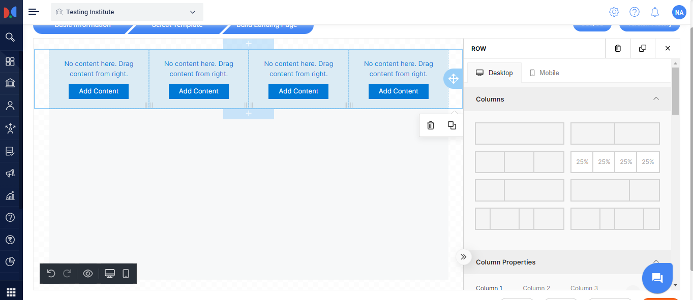
To add up to 4 columns:
First, select the row by clicking on the block/row.
Row & Column properties will appear on the right.
Click on the column number and respective columns will appear on the left side.
To add more than 4 columns: In the 'Column Properties' tab, click '+'. There is no limit on column selection.

Resize a column: Resize the column by selecting & dragging the cursor between two row lines.

Delete a column: In the 'Column Properties Tab' click on the '' icon.

Column Properties: For a particular column, different properties can be used including Background-color, Padding (all sides) and Border.
Add multiple rows in the same block: This option is only possible if
2 or more columns are added in a block
Both column's heights are uneven
For Example:
While 2 or more columns are added, add an image in the 1st column and text in the second.
Add a row below the 2nd column (since the height is uneven for the text column), and add any content box from the right side (divider, image, text, html, video, etc).
Buttons: It's the landing page section you click to take the desired action.
Add button: Drag the button icon from the 'Content' and drop it in the builder area.

Convert button into Call To Action (CTA): Click the Action Button block/row to open its settings on the right.
Button Action: Click this button to redirect the prospect. Add a URL and choose to open it in the same or a new tab.

Colors Settings: Multiple settings can be changed in the button which includes text color change, background color of the block, hover text, and hover background color.

Button Size: Button Size or width can be changed using this feature.

Button Alignment: Button alignment can be done in 3 ways: Left, Center, and Right.

Line Height: Increase the height of the button by increasing the %age.
Rounded Border - Give the border different shapes by increasing the rounded border. By default, the border is rectangle-shaped.


Border: Enhance the button’s appearance by adding a border.
Adjustable on all sides.
Available styles: Solid, Dotted, Dashed.

Divider: Use a divider to separate content blocks. Select the divider from the right-hand side and place it where needed.

HTML:
When to use this:
To add special effects or major UI adjustments.
If you already have HTML code.
To add features not available in the drag-and-drop template.

Add this feature to any columns or block by dragging it from the right side to the left area.
Write HTML: Click the column where the HTML content box was dropped. A window will open on the right to paste or write HTML. By default, "Hello World" appears.

Image: A popular drag & drop feature with three key options:
- Upload images from your system
- Use builder images
- Apply effects & more
1.Upload Images from your system
Drag and drop the Image content box from the right panel into any column where the image is needed.
Click the image in the builder to open its settings.
Select Upload Image to choose a file from your system. Once uploaded, the image URL will appear automatically where this image would be uploaded.
Additional settings:

Auto Width: Adjust image width
Align: Set alignment (left, center, right)
Link: Make image clickable by adding a redirect URL
Container Padding: Add spacing around the image
Effects: Apply visual effects to enhance the image.
2.Use Builder Images
This add-on feature offers access to millions of licensed images preloaded in the builder.
To use it:
Select the Image block
Enter relevant keywords to search
Drag & drop the desired image in respective column
The image will upload, and its hosted URL will appear in the Image URL field.
How to use this?Click the uploaded image to open the upload window. Then, click "Apply Effects & More" to open the editing window.
Available Image Editing Options:
Resize, Crop, Rotate/Transform, Draw, Add Text, Shapes, Stickers, Frames, Corners, Background Color, and more.

Note: Don’t forget to Apply and Save changes after editing.

Text Content Panel: One of the most used features in Drag & Drop Templates.

How to use:
Drag the Text block into your template.
Replace the default text with your own content.
Text editing options (within the block):
Font family, size, style, alignment
Bullet/numbered lists
Text color & background
Add/remove links
Right panel options:
Text color, alignment, line height
Link styles (hover color, underline, etc.)
Container padding
Adding Tokens or Widget:
1.Widget: This advanced feature lets you reuse existing lead-capturing widgets in the drag-and-drop template.

To enable a widget:
Drag a text content panel into a column.
Click on the content column to open the pop-up.
Click Widgets to view all active widgets.
Select the desired widget to add it to the landing page.
Alternatively, use {{RegistrationForm}} for registration tokens or {{widgetID}} for a specific widget.
2.Token: It helps personalize communication and add college details (address, email, logo, etc.). To use a token:
Drag & drop a Text Content panel into a column.
Click the content block to open a popup.
Tokens appear below the widget list.
Select the desired token to enable it on the landing page.
Video Integration on the landing page:

Drag & drop a Video Content panel.
Click the video block to open a window and add the video URL.
Add padding to the container for a clean layout.
Tab Creation Tool: Create a TAB Structure with This Tool. Display different data in each tab. Follow these steps:

Drag & Drop the TAB icon.
Click the TAB to open the settings panel on the right.
Choose Horizontal or Vertical layout.
Click Add TAB to insert and configure content for each tab.

Unlimited tabs can be added.
Set Container Padding on all sides.
Additional Features:
Supports HTML or plain text content.
Customize Header Color and Text Alignment (Left, Center, Right).
Adjust TAB Width, especially for horizontal layouts with 3+ tabs.
Set TAB Background, Active Color, Hover Color.
Align content: Left, Center, or Right.
Menu: Use this tool to create a Menu structure and display different content in each Menu.

Steps to Create a Menu:
Drag & drop the Menu icon.
Click the Menu to open a right-side panel to define structure and content.
Click Add New Item to add content to the first Menu.
Repeat Add New Item to create more Menus (no limit).

Customization Options:
Content Alignment: Left, Center, Right
Container Padding: Adjustable on all sides
Header Text Alignment: Left, Center, Right
Menu Active Color & Background
Menu Hover Color
Image & Text tool:This feature lets you add text on top of an image. Here's how to use it:

Drag and drop the Image & Text tool into a column.
Click the tool to open settings on the right.
Upload an image and add your text.
Adjust the width as needed.

Text Container Settings:
Align/position the text box
Set text alignment inside the box
Adjust padding, border, background color, and height
Hide a Block on Mobile or Desktop:

If a block has been created for the desktop version, it can be hidden from mobile and vice versa.
To hide a block on mobile, select the respective column. In the right panel, scroll down and enable the toggle to hide it on mobile.
Do not Stack: Enable this to display elements side by side on mobile instead of stacking vertically. After creating the Application page, proceed to the Thank You page (except for Landing Pages).

Step 8: Finalize and Publish
Once you’re satisfied with the layout and design:

Click Save to preserve your work.
Preview your landing page to check for any issues.
When ready, click Publish to make the page live.
Points to Keep in Mind
Mobile Responsiveness: Ensure your landing page is optimized for mobile devices.
Element Spacing: Use padding settings to ensure elements don't appear too cramped.
Testing: Preview your landing page before publishing to ensure it looks great on both desktop and mobile.
Conclusion
By following these steps, you can easily create a marketing page using Meritto’s Drag & Drop Template Editor. Customize your page to fit your brand, add engaging content, and start converting visitors into leads.
Related Articles
Related Articles
How to Create Drag and Drop Template for Email?
Overview Creating Drag-and-Drop Email Templates allows users to design visually appealing emails without coding expertise. User-Friendly Design: Build engaging email templates with an intuitive drag-and-drop interface. Customization Options: Easily ...How to Create Marketing Automation?
Introduction: Marketing Automation is tool to streamline, automate and communicate which provides a personalized experience for students & accelerate students in their enrollment journey. So, let’s dive in to know more about how to create Marketing ...How to Create a Landing Page using HTML builder?
Overview A Landing Page is a standalone web page designed for marketing and advertising purposes. It is where visitors land after clicking on a promotional link in an email, advertisement, or social media post. This article will guide you through the ...How to Create Document Template?
Overview This article guides you through creating and managing Document Templates in Meritto. Document Templates are preformatted documents that can be displayed on the Applicant Dashboard or used internally by backend users. For more details, refer ...How to Create HTML Template for Email?
Overview Creating HTML Email Templates allows for complete customization and control over email design, ensuring effective communication. Custom Design: Build emails tailored to your brand and messaging. Flexible Layouts: Use HTML to structure and ...